

Smash'd
Engineering a Bold Fast-Casual Identity: The SMASH’D Brand Story
What happens when a burger is more than just a meal? This hypothetical case study explores how Stravise Ghana could transform SMASH’D from a burger concept into a bold, recognizable food experience. One built around appetite, personality, consistency and convenience.
Problem Statement
The challenge was bigger than creating a restaurant logo. SMASH’D needed to establish a distinctive identity in a highly competitive fast-food market where burgers, fries and delivery services can easily begin to look and feel the same. The brand needed to answer a simple question: Why should someone remember SMASH’D after the meal is finished? Our hypothetical strategy focused on creating a brand that felt youthful, energetic and unapologetically food-focused, while maintaining enough consistency to work across a restaurant, digital platforms, packaging, apparel and advertising.
Solution
Stravise Ghana developed a cohesive brand experience around the idea of “real hunger.” Rather than overcomplicating the identity, the strategy uses bold red and warm cream tones, strong typography, appetizing food photography and repeated brand elements to create instant recognition. The brand experience was designed to make SMASH’D feel energetic and accessible from the first impression on an outdoor billboard, to ordering through the app, receiving a branded burger box and finally sitting inside the restaurant. Every touchpoint tells the same story: SMASH’D is fresh, bold, satisfying and made to be remembered.
Logo

The SMASH’D logo is the foundation of the identity. Its bold, custom looking lettering gives the brand a distinctive personality. The custom lettering features expressive contours that reflect the “smashing” concept while maintaining high legibility across digital screens and outdoor signage. The two primary colourways cream on red and red on cream, allow the logo to work effectively as a standalone brand asset without competing with the food imagery.
Brand Accessories
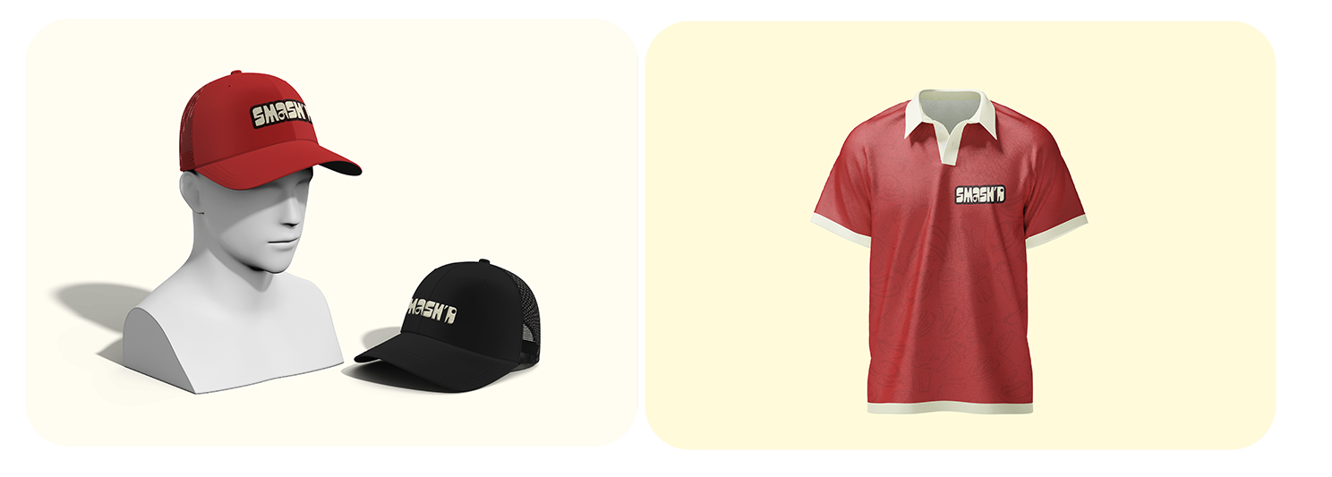
To extend the brand into everyday lifestyle culture, we designed premium staff apparel and promotional merchandise. The objective is simple: make the brand visible even when the customer is no longer inside the restaurant. The SMASH’D T-shirt and caps use the logo prominently while keeping the overall design clean and wearable.
Product Packaging
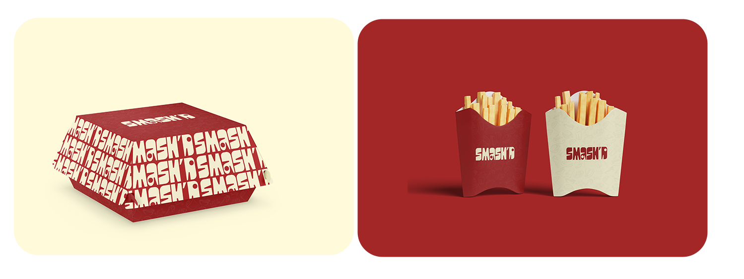
Packaging was designed as a key visual asset for social sharing and unboxing experiences. The packaging turns an ordinary takeaway into a branded experience. The burger box uses a bold red base covered with a repeated SMASH’D pattern, transforming the packaging itself into a visual extension of the brand. This is particularly valuable because takeaway packaging travels beyond the restaurant; it appears in offices, cars, homes, and social-media photos. Every box becomes a small piece of mobile advertising.
The App
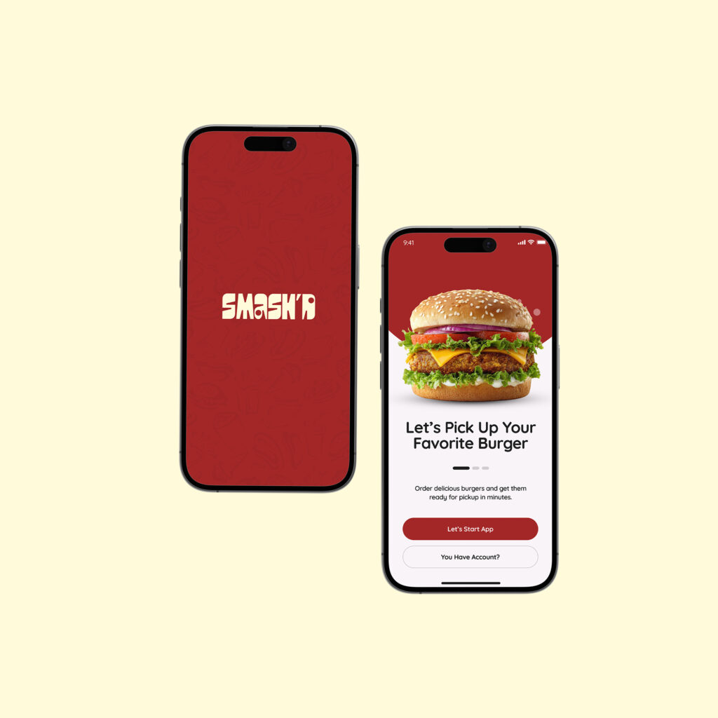
Convenience is an important part of the modern food experience. We designed an intuitive, conversion-focused mobile interface tailored for quick ordering. The interface focuses on the essentials: discovering burgers, selecting favourites, placing an order, and receiving food with minimal friction. The prominent food imagery creates appetite while the clear calls-to-action encourage customers to move quickly from “I’m hungry” to “Order placed.”
The Website
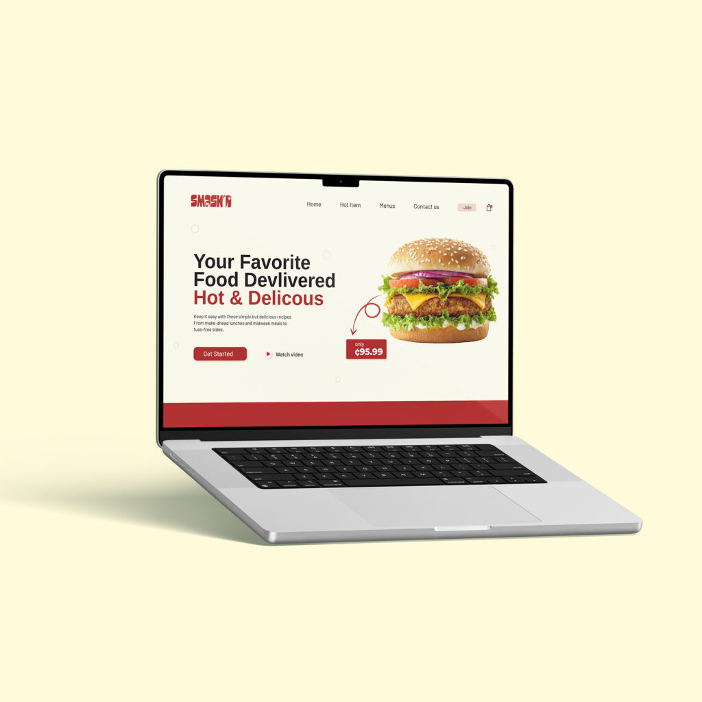
The hypothetical SMASH’D website acts as the brand’s digital storefront. Its visual direction combines strong food photography, generous whitespace, and the brand’s red-and-cream palette to immediately communicate appetite and convenience. The messaging “Your Favorite Food Delivered Hot & Delicious” puts the customer’s primary need at the centre. The website is structured around fast discovery and conversion: explore the menu, find a favourite, place an order, and get the food delivered. The experience is intentionally simple because when someone is hungry, they shouldn’t have to work hard to find food.
The Restaurant
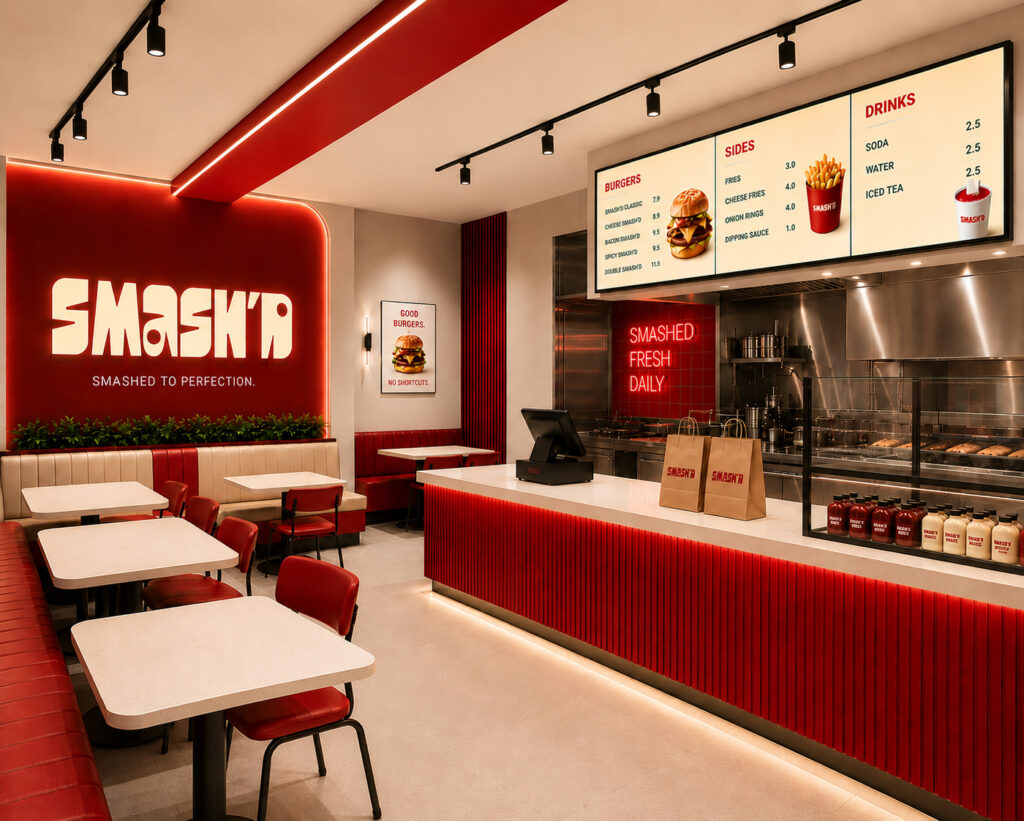
The physical restaurant brings the entire brand system to life. The interior concept uses red architectural accents, cream surfaces, bold SMASH’D signage, and clear menu boards to create an environment that feels modern, energetic, and unmistakably connected to the brand. The repeated visual language across the walls, counters, menus and signage reinforces recognition while the seating area creates a space where customers can eat, socialize and experience the brand beyond the food itself. The restaurant therefore becomes more than a place to buy burgers it becomes a physical expression of the SMASH’D identity.
Through a comprehensive strategic framework, Stravise Ghana successfully elevated SMASH’D from a standard food venture into an iconic, recognizable fast-casual brand. Every customer interaction, from seeing an outdoor advertisement, visiting the website, ordering through the app, receiving a branded package, wearing a cap, or walking into the restaurant, should feel like the same brand. The result is a brand designed not only to sell burgers, but to build recognition, create customer memory, and become part of the customer’s everyday food culture. SMASH’D. Made for real hunger.