

Prime Nest
Designing for Trust in Accra’s Real Estate Market: The Prime Nest Case Study
Problem Statement
Searching for a home in Accra can be a daunting task. Prospective buyers and renters face inconsistent pricing, limited transparency, and agents who prioritise transactions over long-term fit.
For many, the search goes beyond securing a property to finding a space that aligns with their lifestyle, commute, and sense of stability.
Crafting the brand for Prime Nest, a real estate company, will therefore come with the challenge of positioning the company as a trusted partner in this journey.
When working with Prime Nest, the Stravise team will curate branding elements that highlight the business’s vision. That is to move beyond listings and become a reliable guide in helping clients find spaces they can truly settle into.
To position Prime Nest as the go-to property listing service, the Stravise team developed a branding approach that emphasizes trust, guidance, and lifestyle alignment. We start by unpacking the business itself. Understanding the business story, values, and what sets it apart from other businesses. Next, we engage with residents across Accra to understand their frustrations, hopes, and priorities when finding a home. These findings inform the design of Prime Nest’s branding. Every element will reinforce trust and reliability, making a complex market navigable for clients. |
Designing the Logo
In designing the Prime Nest logo, the goal was to make clients feel immediately confident and at ease. The design places the business name prominently, ensuring instant recognition. After exploring multiple concepts, the team selected a palette of blue and light brown. Blue for the calm assurance clients seek when making big decisions, and light brown to symbolize stability, rootedness, and a true sense of home.
Several concepts were tested, each exploring different balances of modernity, warmth, and approachability. The final design combines clean typography with a grounded color palette, creating a logo that is memorable, professional, and emotionally resonant with Accra’s home seekers.
Social Media
For Prime Nest, social media is not going to be treated as a content box to tick, but as a space to build trust in a market where credibility is everything.
The team will focus on platforms that drive engagement in Accra’s property scene, using a mix of property showcases, neighborhood insights, and practical guidance for home seekers. Each piece of content is designed to answer a question, reduce uncertainty and bring clients a step closer to making a confident decision.
By prioritizing interaction over volume, Prime Nest’s social media presence will evolve into a community where clients become active participants in their home-search journey.
Corporate Accessories
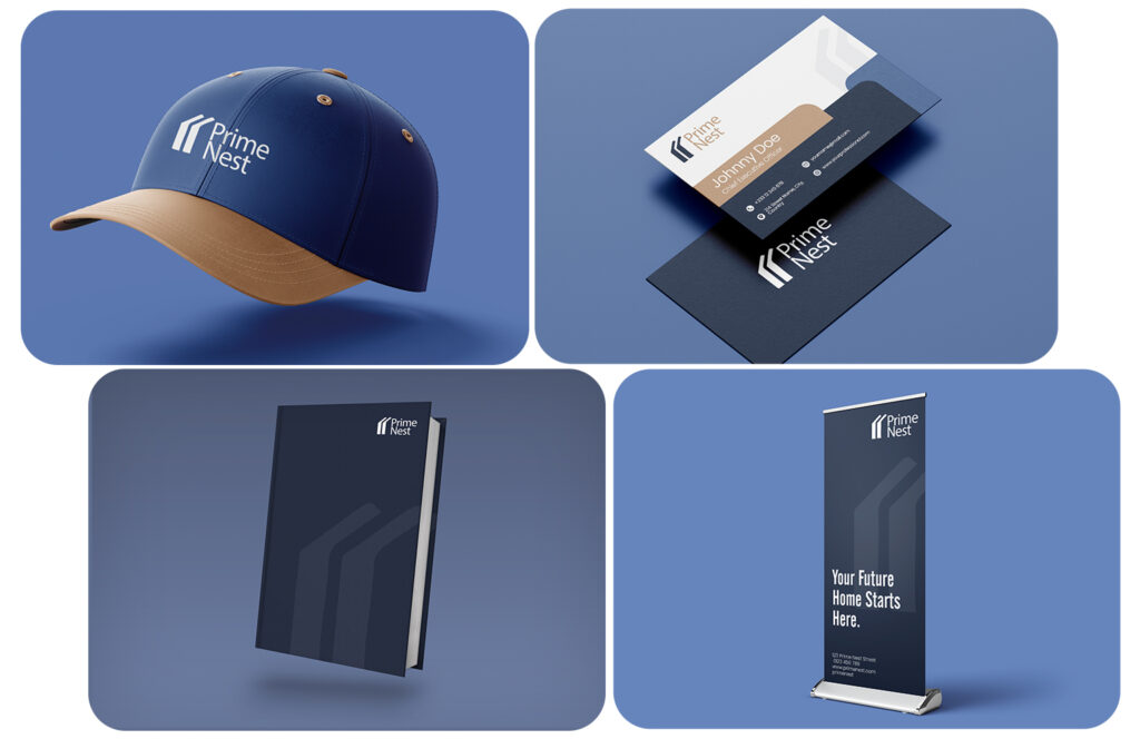
To extend the Prime Nest brand beyond digital platforms, the Stravise team will develop a range of corporate accessories designed to embed the brand into everyday client and field interactions.
Consistency was central to the approach. Business cards, notebooks, caps, and banners all carry the same refined color palette and minimalist design language, ensuring immediate recognition and a cohesive brand experience.
Rather than treating these as promotional items, the focus was on creating tangible brand assets that enhance recognition, build credibility, and leave a lasting impression on clients and partners.
Website
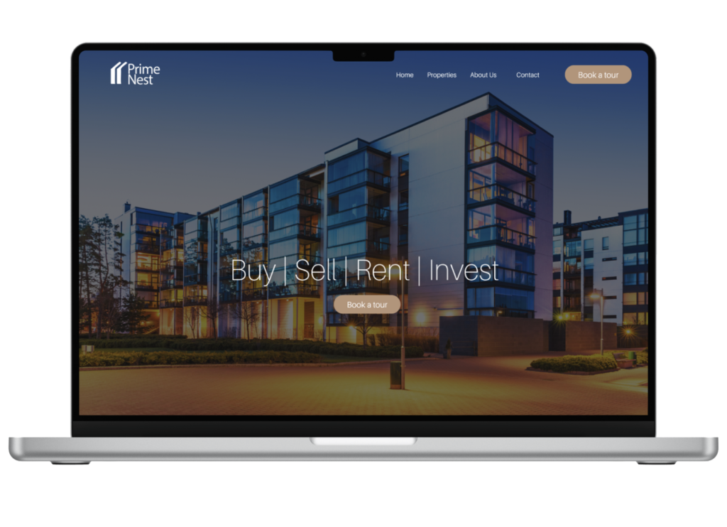
The Prime Nest website will be designed as a central platform to support clients throughout their property search journey. Rather than functioning as a simple listing site, the focus was on creating a clear, intuitive experience that helps users navigate options with confidence.
The structure prioritizes ease of access to property information, while also providing insights that guide decision-making, such as location context and service offerings.
The team goes a step further to ensure that the website complements Prime Nest’s social media presence by serving as a reliable hub for
up-to-date information on listings, services, and community initiatives. This ensures a consistent and connected brand experience across all digital touchpoints.
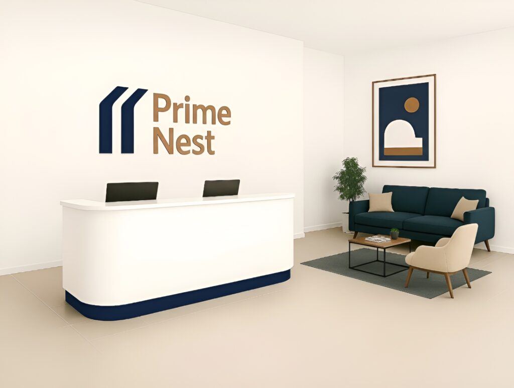
The Reception
The reception space is designed as the physical introduction to the Prime Nest experience. Every element, from the restrained color palette to the clean, uncluttered layout, works to create a sense of ease and confidence. The prominent placement of the logo reinforces brand identity, while the overall spatial design reflects the company’s commitment to clarity and reliability. This environment is intentional. It reassures clients from the moment they walk in that they are in capable hands, reflecting Prime Nest’s role as a trusted guide in their property journey. |
Final Thoughts
We understand that effective real estate branding goes beyond visuals to build trust, clarity, and connection. By aligning every touchpoint with a clear purpose, the Prime Nest brand is positioned to guide clients confidently through their property journey.